FancyDrawer
Component
The withFancyDrawer function is a HOC that enhances a given component with additional animations and styles to simulate a fancy drawer effect.
The code makes use of React hooks and animation libraries (useDrawerProgress, useDrawerStatus, and useAnimatedStyle) to dynamically apply animations based on the drawer's state and progress.
withFancyDrawer
Type: withFancyDrawer<T>(Component: React.ComponentType<React.PropsWithChildren<T>>)
Example
- CustomDrawerContent
- _layout
- ModalScreen
- ChatScreen
/src/components/CustomDrawerContent.js
import React from 'react';
import {
  DrawerContentComponentProps,
  DrawerContentScrollView,
  DrawerItem,
  DrawerItemList,
} from '@react-navigation/drawer';
import { View, StyleSheet } from 'react-native';

import Avatar from '@flexnative/avatar';
import Ionicons from '@expo/vector-icons/Ionicons';


const profilePic = require("../../../assets/icon.png");

/**
 * The drawer itself
 */
export default (props: DrawerContentComponentProps) => {
  return (
    <DrawerContentScrollView style={styles.container} {...props} >
      <Avatar style={styles.avatar} source={profilePic} size='large' />
      <DrawerItemList {...props} />
      <Separator />
      <DrawerItem
        label="Logout"
        activeTintColor='white'
        inactiveTintColor='white'
        icon={(props) => <Ionicons name="log-out-outline" size={props.size} color={props.color}/> }
        onPress={() => console.log('help')}
      />
    </DrawerContentScrollView>
  );
}

const Separator = () => (
	<View style={styles.separator}></View>
)

const styles = StyleSheet.create({
  container: {
    paddingTop: 50
  },
  avatar: {
    marginBottom: DEMO_COMPONENT_GAP
  },
  separator: {
		margin: 15,
		height: 1,
		width: '100%',
		backgroundColor: '#ffffff30',
  }
});
/app/_layout.jsx
import React from 'react';
import { PureComponent, ReactNode } from 'react';
import { Drawer } from 'expo-router/drawer';

import Icon from '@flexnative/icons';
import ThemeContext from '@flexnative/theme-context';

import DrawerContent from '@/screens/components/Navigation/CustomDrawerContent';


export default class DrawerScreen extends PureComponent {

  static contextType = ThemeContext;
  declare context: React.ContextType<typeof ThemeContext>;

  render(): ReactNode {
    return (
      <Drawer
        screenOptions={{
          drawerType: "slide",
          drawerStyle: {
            width: 250,
            backgroundColor: this.context.colors.primary
          },
          drawerInactiveTintColor: 'white',
          drawerActiveTintColor: 'white',
          drawerActiveBackgroundColor: '#ffffff30',
          overlayColor: 'transparent',
          headerTitleStyle: {
            fontFamily: 'fontRegular',
          },
        }}
        initialRouteName={'Home'}
        drawerContent={DrawerContent}>
        <Drawer.Screen
          name="Home"
          options={{
            title: "Home",
            drawerIcon: (props) => <Icon name="star" size={props.size} color={props.color}/>
          }}
        />
        <Drawer.Screen
          name="Modal"
          options={{
            title: "Modal",
            drawerIcon: (props) => <Icon name="modal" size={props.size} color={props.color}/>
          }}
        />
        <Drawer.Screen
          name={'Chat'}
          options={{
            title: "Char",
            drawerIcon: (props) => <Icon name="popup" size={props.size} color={props.color}/>
          }}
        />
      </Drawer>
    );
  }
}
/app/Modal.jsx
import React from "react";
import { View, Text, StyleSheet} from "react-native";
import {
DrawerActions,
useNavigation,
} from '@react-navigation/native';
import { withFancyDrawer } from "@flexnative/navigation";
import Button from "@flexnative/buttons";
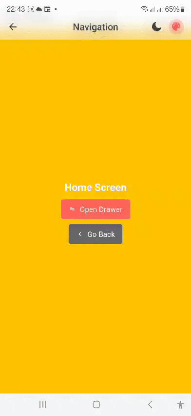
function ModalScreen(props: any) {
const navigation = useNavigation();
return (
<View style={styles.container}>
<Text style={styles.text}>Modal Screen</Text>
<Button text='Open Drawer' iconLeft='menu' color='primary' onPress={() => navigation.dispatch(DrawerActions.openDrawer())} />
<Button text='Go Back' iconLeft='chevron-left' color='secondary' onPress={() => navigation.goBack()} />
</View>
);
}
const styles = StyleSheet.create({
container: {
flex: 1,
rowGap: 20,
backgroundColor: '#16a085',
alignItems: 'center',
justifyContent: 'center',
},
text: {
fontSize: 22,
color: '#fff',
fontFamily: 'Bold'
}
});
export default withFancyDrawer(ModalScreen);
/app/Chat.jsx
import React from 'react';
import { View, Text, Image, ScrollView, StyleSheet } from 'react-native';
import {
  DrawerActions,
  useNavigation,
} from '@react-navigation/native';
import { withFancyDrawer } from '@flexnative/navigation';
import Button from '@flexnative/buttons';
import { useThemeContext } from '@flexnative/theme-context';


function ChatScreen() {
  const navigation = useNavigation();
  const theme = useThemeContext();

  return (
    <ScrollView style={styles.container}>
      <View style={[styles.header, { backgroundColor: theme.colors.secondary }]}>
        <Button size='large' iconLeft='menu' radius='full' color='secondary' type='text' onPress={() => navigation.dispatch(DrawerActions.openDrawer())} /> <Text style={[styles.headerText]}>Chats</Text>
      </View>

      {chatItems.map((item, index) => (
        <View key={index} style={styles.chatItem}>
          <Image source={item.avatar} style={styles.avatar} />
          <View style={styles.chatText}>
            <Text style={styles.chatName}>{item.name}</Text>
            <Text style={styles.chatMessage}>{item.message}</Text>
            <Text style={styles.chatDate}>{item.date}</Text>
          </View>
        </View>
      ))}
    </ScrollView>

  );
}

export default withFancyDrawer(ChatScreen);

const chatItems = [
  {
    name: 'Tetra',
    message: '~ Blerim Hasa: Po do futem un tani',
    date: '03/12/2024',
    avatar: require('../../../assets/icons/avatar-1.jpg'),
  },
  {
    name: 'Eli',
    message: 'Tani e fika',
    date: '02/12/2024',
    avatar: require('../../../assets/icons/avatar-2.jpg'),
  },
  {
    name: 'Lorenci',
    message: 'Reacted 👍 to "Shumë faleminderit"',
    date: '02/12/2024',
    avatar: require('../../../assets/icons/avatar-3.jpg'),
  },
  // Add more chat items as needed
];

const styles = StyleSheet.create({
  container: {
    flex: 1,
    backgroundColor: '#fff',
  },
  header: {
    padding: 7,
    columnGap: 20,
    display: 'flex',
    flexDirection: 'row',
    alignItems: 'center',
    backgroundColor: '#f8f8f8',
    borderBottomWidth: 1,
    borderBottomColor: '#eee',
  },
  headerText: {
    fontSize: 18,
    fontWeight: 'bold',
    color: 'white'
  },
  chatItem: {
    flexDirection: 'row',
    padding: 15,
    borderBottomWidth: 1,
    borderBottomColor: '#eee',
  },
  avatar: {
    width: 50,
    height: 50,
    borderRadius: 25,
    marginRight: 15,
  },
  chatText: {
    flex: 1,
    justifyContent: 'center',
  },
  chatName: {
    fontSize: 16,
    fontWeight: 'bold',
  },
  chatMessage: {
    color: '#666',
  },
  chatDate: {
    color: '#aaa',
    fontSize: 12,
  },
});